How to Use Z-Pattern Layout for Effective Website Design
All, Web Design,
Published on: October 11, 2024
In today's web design, a well-designed website keeps its users more engaged towards the website. Among many such layouts that have become popular among users and web designers these days, there is Z-pattern website design. This structure makes the best of the natural flow through which the human eye travels as it moves around and engages with the page. In this blog, we'll outline the principles of the Z-pattern design, how that is actually to be implemented, and how useful that might be for brands like Xtreme Technologies.
What is the Meaning of a Z-Pattern Layout?
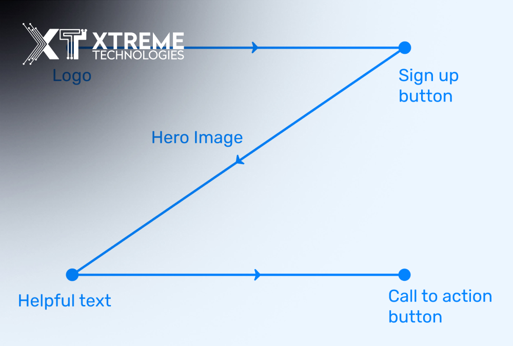
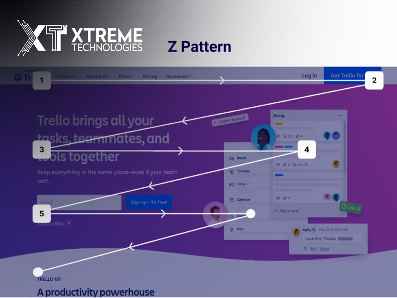
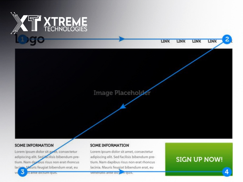
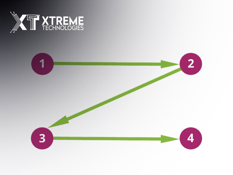
The Z-pattern layout website does create a visual hierarchy akin in shape to a "Z." This works by showing the view from the top left of the page across to the top right, diagonally down to the bottom left, and then finally across to the bottom right. This pattern is the way most people look for information on a website and therefore reflects a construct applied for delivering seamless user experience.
Key Elements of the Z-Layout Structure
- Top Horizontal Line: very frequently used for a logo, menu bar, and a call-to-action (CTA) at the middle of the Z; that's where the majority of visitors will direct their eyes' attention at the first glance; so it is great to fill in with elements of your brand and the most important links.
- Diagonal Line: The diagonal line of the Z will draw your eye across the page and open a pathway for you to make it possible to create a visual hierarchy from your top element on the page to your bottom element. Fill this space with images, headlines, or key messages that capture attention.
- Final Bottom Horizontal Line: Usually, it's the last line of the Z pattern, comprising of miscellaneous CTAs and other information or links to other related resources. This is your call-to-action section that helps push the users to the next action. It may be the call to sign up for a newsletter, make a purchase, or view more content.

Principles of Web Design Z-Pattern Layout
However, all these depend on a proper understanding of the underlying web design principles that form the Z-pattern layout website. For instance,

-
Visual Hierarchy
This visual hierarchy should lead your users around your website. For instance, whenever you employ a Z-pattern layout, high-value items must be evident along the lines of the Z. Scale, color, and contrast may help them notice the CTAs as well as the information they deem important. For instance, in terms of bold colors, buttons are more significant and prominent whereas less value parts are smaller and do not shout.
-
Consistency
Design consistency refers to how your website manages to provide a uniform experience for your users. This involves the color scheme, typography, and overall layout of the design for your whole website. This kind of consistency showcases your brand identity as it makes navigation easier for your users on your website.
-
Reduce the Complexity
Simplify: Web designing is easy if the approach is something simple. A Z-pattern layout is likely to be streamlined upwards because its focus lies in guiding the users through the information that makes them just scroll down and not get baffled.
Minimize clutter: Remove everything. Just make sure that each element has a purpose. It does not mean it adds to distraction but enhances user engagement.
Application of Z-Pattern Layout
Now that you have a concept about the general idea of Z-pattern layout, let's learn how the application is carried out in complete detail.

-
Creating from Wireframes
It's a great idea to make wireframes if you need to work out the placement in a Z-pattern before you settle on final design methods. Sketch the key elements that you would like to feed into your design and see that they line up with a Z flow. This process will help change things for someone before getting fully invested in the final design.
-
Key Elements
As you generate your Z-pattern design, it is important to preserve a few of the crucial elements that will inevitably draw attention toward the user. Some of these involve the following:
Logo and Branding: In the upper left for brand recognition to be set as early as possible.
Navigation Menu: Navigation links are very visible and properly labeled to ensure a perfect experience from the use.
CTAs: The prominent CTAs in this design are combined with two majors placed at the bottom right and top right to hasten the user into action.
-
Image and Graphics
Captivating the eyeball attention of users is the game when using imagery so use as many images, icons, and graphics you can to ensure you get as much eyeball attention along the Z path. Imagine setting a beautiful image or infographic at the bottom of the diagonal of the Z, illustrating your point creates quite an urge in users to scroll down to the end.
-
Mobilize
You can't ignore the mobile-first world right now, so, your Z-layout must be responsive and mobile-friendly. For scanning on smaller mobile screens, patterns of users' scanning might differ from those for desktop; think how the Z-pattern translates to those screens, making elements tappable with legible info hierarchies.
-
Test and Iterate
Use user feed and analytics after the design rollout to measure how effective your design is. Track how users navigate through your site where they click on it and for how long, and based on this information, apply it to informed layout changes and encourage user engagement.
| Aspect | Description |
|---|
| What is the Z-Pattern Layout? | The Z-pattern layout is a web design structure that mimics the natural reading pattern of users. The eyes scan from left to right in a zigzag motion, forming a “Z” shape across the page. |
| How the Z-Pattern Works | Users’ eyes first move across the top horizontal line, then diagonally to the opposite side, and finally across the bottom line, creating an intuitive flow that guides attention to key areas. |
| Key Benefits of Z-Pattern Design | This layout leverages natural eye movement to highlight essential information and CTAs (call-to-action), enhancing user engagement and conversion rates. |
| When to Use Z-Pattern Layout | Z-pattern design is effective for simpler websites or pages with minimal content, such as landing pages, portfolios, or blogs, where a streamlined flow can be beneficial. |
| Implementing the Z-Pattern | Place the logo and navigation at the top left, a prominent CTA on the top right, core content or visual at the center, and a final CTA at the bottom right to guide users seamlessly. |
| Design Tips for Z-Pattern Layout | Use clear visual hierarchy, contrasting colors, and whitespace to draw attention to focal points in the “Z” path. Make use of strong CTAs and place them strategically along the Z path. |
| Z-Pattern’s Role in Brand Design | Brands like Xtreme Technologies can utilize the Z-pattern to create an intuitive and engaging user experience, effectively guiding visitors towards desired actions on the website. |
Benefits of Z-Pattern Layout
-
Increased User Engagement
This kind of Z-pattern layout would make the readers follow your content naturally for maximum engagement. That is, it aligns those critical items with where the human eye goes by default for the maximum chance of desired actions on your site.
-
Enhanced Conversion Rate
FYI: A properly designed structure-a Z-pattern layout can help your conversions. He or she will be even more attuned to your brand Additionally clicking to subscribe, to make a purchase, or to learn more content he or she can easily navigate around your site and find the key information he or she needs or relevant CTAs.
-
Brand Awareness
It can also be applied in a manner that will help to demonstrate your brand personality. Actually, by using your brand colors around the Z pattern flow and placing your logo along the flow, users will be able to identify and recall your brand, which will lead to loyalty as well as trust.
On matters to do with online presence, the difference will be huge with a Z-pattern layout on Xtreme Technologies. Such an approach will lead the visitor by the path they must follow to make the most informed decisions, but while at it, they showcase the innovative technology solutions Xtreme Technologies offers.
A header image might scream the latest product offered, with a clear CTA to learn more. Beneath, scrolling down reveals the diagonal flow that contains their testaments or case studies and leads to another CTA asking for a demo or consultation. All of this, again, is designed to both inform and engage potential customers toward eventual conversion.
Conclusion:
The Z-pattern website design easily converts into something more interactive for the users, and hence increases the general performance of the web. Very easily, one can apply web design principles like; visual hierarchy, consistency, and simplicity among others, in this layout. Brands like Xtreme Technologies use the Z-pattern to empower more conversion rates and increase brand awareness. As you begin creating your website, it will be considered so effective because it directs your users to bring them into an online experience with the Z-pattern layout.
Read Also: What Is DR and UR in SEO? A Quick Explainer Using Ahrefs
Here are three frequent questions for a blog on how to use the Z-pattern layout to have an effective website design:
FAQs
Q1: What is a Z-pattern website design"?
A Z-pattern website design follows the shape of the letter "Z". This pattern leads a user's eyes from the top-left corner of the webpage across to the top right, diagonally down to the bottom left, and then across to the bottom right. The layout can be highly effective in improving user engagement by focusing users' attention on certain elements on the page.
Q2: How do the principles of visual hierarchy apply in the Z-pattern layout?
The application of visual hierarchy for the Z-pattern layout will arrange the content in a manner that users scan according to its natural order and flow when viewing the webpage. The most critical elements such as the logo, navigation menu, and calls-to-action can be set strategically along the flow of Z to make these critical things that can easily be accessed and clicked by the users.
Q3: Advantages of Z-pattern layout in web design
The use of a Z-pattern layout will bring many benefits like more user engagement, better conversion rates, and increased recognition of the brand. The reason is that it makes sure all key elements on the web are aligned with normal pathways of users' eyes, leading to effective navigation for visitors and desired actions toward an effective web design.


Recent Comments